
网上流传着一条一千五百字的提示词,审美非常好——可以把照片变成独立杂志封面:上半张是原封不动的照片,下半张是手绘的小插画,凑一起像本独立出版物。
全篇一千五百字,比不少文章都长。但为什么这么长的提示词反而比 15 个字的好用?
为什么形容词不如数字和边界有用
这条提示词的关键特点是用精确的数字和明确的边界替代了模糊的形容词。比如"严格 3:4 竖版构图""画面水平分为两个完全相等的部分,精确 1:1 高度比"。数字替模型做决定——你说"上下两部分",模型还得猜比例是多少;写 1:1,它就不用猜了。提示词里每让模型猜一次,就多一次跑偏的机会。
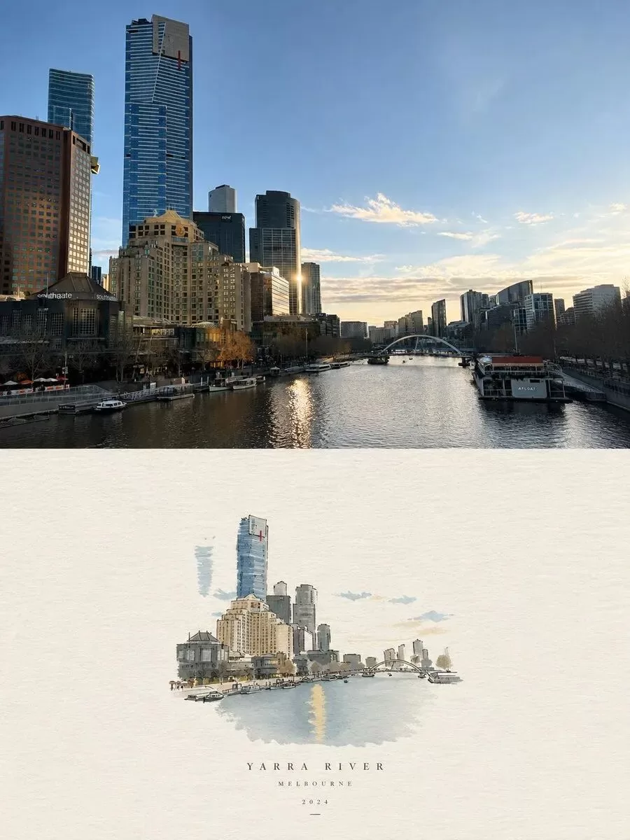
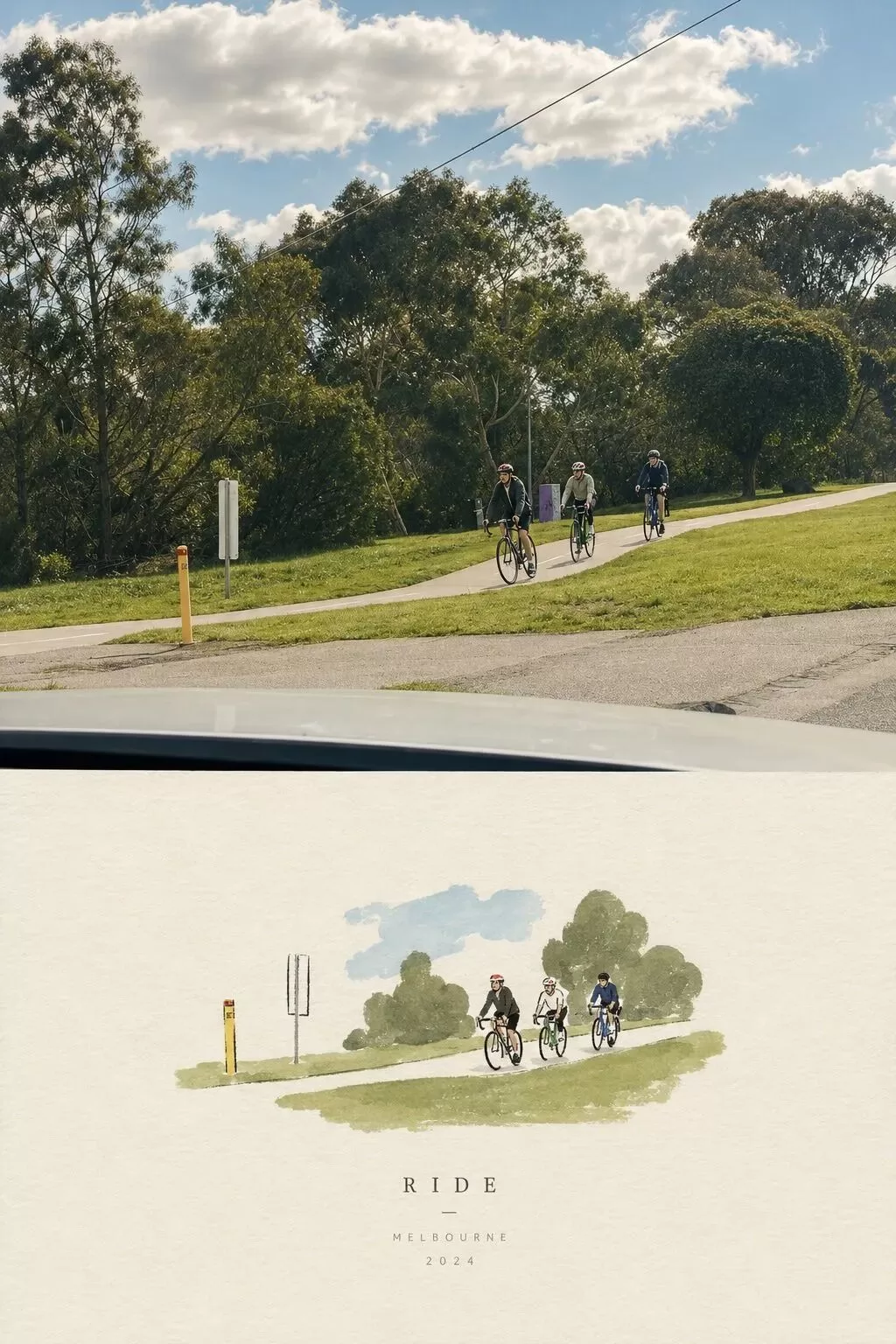
用边界管住模型的手
很多时候模型翻车,毛病出在没说清哪些东西不能碰。你写了"艺术化""风格化",模型为了讨好你,转头就把人脸改了。先把红线划上,等于给后面所有风格要求套了个笼子。调色可以,加纹理可以,笼子里的别动。
提示词里"不许动"那部分应该比"想要什么"写得更啰嗦。想要什么模型自己会发挥,不许动什么你不说它就一定动。这条提示词同时禁了"纯线稿"和"复杂写实插画"——一边不能简单到只剩线,一边不能复杂到接近写实。两条边界往中间一夹,剩下那条窄缝才是它要的东西。
完整提示词
这条 1500 字提示词的核心结构:
- 精确的数字比例:3:4 构图、1:1 分割,不让模型猜
- 明确的不许动清单:保持主体构图、面部特征、身体比例、姿势表情不变
- 克制的风格修饰:"subtle""sophisticated"限定调色深度
- 两边边界夹击:禁纯线稿 + 禁复杂写实,锁定中间风格区间
- 可验证的结果标准:违反了能不能看出来?形容词说不清,数字和边界能
完整英文提示词(可直接使用):
Create one independent high-end editorial poster for each uploaded photo. Do not combine multiple photos into a collage. Each photo must be processed and output as a separate poster.OVERALL FORMATStrict 3:4 vertical composition.Divide the canvas horizontally into two exactly equal sections, with a precise 1:1 height ratio.The top half occupies exactly 50% of the canvas.The bottom half occupies exactly 50% of the canvas.The two sections should feel visually connected as one refined art publication cover.TOP HALF — ORIGINAL PHOTOGRAPHPreserve the original photograph as faithfully as possible.Keep the main composition, subjects, identity, facial features, body proportions, poses, expressions, clothing, objects, and spatial relationships unchanged.Preserve the realistic photographic texture, natural lighting, shadows, atmosphere, and original color mood.Apply only subtle, sophisticated editorial color grading, creating the feeling of a premium magazine photograph, contemporary art book, or high-end independent publication.The image should remain photorealistic and authentic, never overly retouched or artificially stylized.If necessary to fit the 3:4 composition naturally, extend the sky, ground, walls, or surrounding environmental background.Background extension must feel seamless and photographic.Never stretch, distort, reshape, replace, or alter the main subject.BOTTOM HALF — MINIMAL HAND-DRAWN PAPER ILLUSTRATIONExtract the most recognizable visual elements from the original photograph and reinterpret them as a minimalist hand-drawn paper-cover illustration.Preserve:The most recognizable subjectEssential silhouette and proportionsKey pose or gestureImportant objectsThe core narrative relationship between people and objectsHighly simplify the image. Remove unnecessary details and retain only the visual information needed for immediate recognition.Use:Delicate, slightly imperfect hand-drawn linesA small number of bold, clearly defined acrylic-style flat color shapesRough paper textureVisible handmade brush marksSlightly irregular, organic edgesSubtle imperfections that make it feel genuinely handmadeThe main illustrated subject should be small, centered, and carefully composed, occupying approximately 10–20% of the bottom half.Leave a large amount of negative space around the illustration.The background should primarily resemble:Rough white paperWarm off-white paperPale natural paperMinimal editorial book-cover stockUse only a few lines or small color shapes to suggest the surrounding environment.COLOR PALETTEExtract the dominant colors directly from the original photograph.Compress the palette into no more than 4 main colors.Keep the colors restrained, sophisticated, and harmonious.Use bold but controlled flat color blocks.Avoid excessive color variation.Preserve subtle paper grain and handmade brush texture.The illustration should visually feel like a simplified color interpretation of the photograph.TYPOGRAPHYA small amount of simple typography may be included when appropriate.Possible elements:A short titleKeywordObject nameLocationYearNumberShort phraseText should be minimal, understated, and editorial.Typography should naturally interact with the large areas of negative space and the small illustration, evoking:Art book coversIndependent publishingContemporary editorial designThoughtful children's picture booksDo not force text into the composition if it does not naturally fit the photograph.VISUAL LANGUAGEThe final poster should feel:Quiet · Poetic · Refined · Minimal · Innocent · Relaxed · Artistic · Thoughtful · High-recognition · PremiumThe visual concept should be:“A small subject surrounded by a large amount of empty space.”The result should resemble a carefully designed independent art publication cover, rather than a commercial advertisement.AVOIDDo not use:Colored-pencil aestheticsCrayon texturesBleeding watercolorPure line-art illustrationComplex realistic illustrationHeavy oil-painting effectsSmooth polished digital illustration3D renderingGlossy 3D texturesCommercial cartoon aestheticsCute commercial character designE-commerce advertising aestheticsGeneric poster templatesExcessive decorative elementsBusy compositionsExcessive typographyFINAL ART DIRECTIONThe top half should feel like a beautiful, authentic editorial photograph.The bottom half should feel like a small, handmade visual poem derived from that photograph.The two halves should clearly belong to the same visual story, while maintaining a strong contrast between photographic realism above and minimal handmade illustration below.Prioritize recognition, restraint, negative space, material texture, subtle imperfection, editorial sophistication, and artistic storytelling over decorative complexity生图效果:形容词管情绪,数字和边界管结果。好提示词的关键不是长,而是每一句都能被验证。你可以把最近用得最顺手的那条提示词翻出来,形容词全圈上,一个一个问——违反了它,我看得出来吗?
声明:本站原创文章文字版权归本站所有,转载务必注明作者和出处;本站转载文章仅仅代表原作者观点,不代表本站立场,图文版权归原作者所有。如有侵权,请联系我们删除。
未经允许不得转载:1500字提示词为什么比15字好用:用数字和边界替代形容词的AI绘画技巧