问题:为什么 AI 生成的界面「能用但不对劲」
给 AI 说「做个暗黑风格的界面」,通常会得到什么?
大概率是:深灰背景 #1a1a2e、亮蓝按钮、无衬线字体、大量留白。能跑,但看起来不对劲——它更像一个没有设计过的界面,不像一个真正的暗黑产品。
不是 AI 不行,而是「暗黑风格」这个描述对 AI 来说太模糊了。没有指定背景分层逻辑、文字层次、强调色克制度,AI 只能从训练数据里抽一个最常见的解法交出来。
好看的界面背后,都有一套说得清楚的规则系统。把规则传给 AI,它就能做出对的结果。
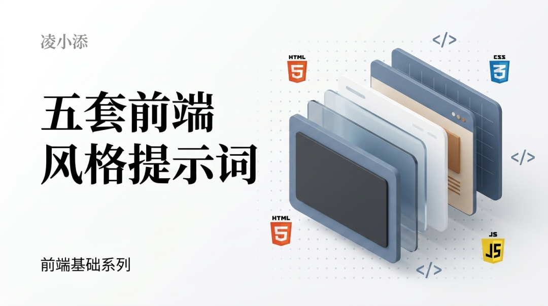
本文整理了五套常用的前端风格提示词:暗黑 UI、管理后台、期刊排版、深色玻璃拟态、极简 SaaS 落地页。每套都包含视觉规则的底层逻辑、AI 最常做错的地方,以及可以直接复制使用的约束清单。
风格提示词是什么,为什么需要它
给 AI 的 prompt 通常有功能描述(做一个登录页)、技术约束(用 React + Tailwind),但很少有视觉系统的约束。
结果就是 AI 交出来的界面,功能对,但视觉语言是随机的。改风格得反复来回,每次改都不完整,因为 AI 不知道这套视觉系统的边界在哪里。
风格提示词解决的是这个问题。它不是描述「感觉」,而是把这套视觉系统写成 AI 能直接执行的约束清单:
- 用哪几个颜色值
- 字体怎么分层
- 间距怎么给
- 哪些效果禁止出现
有了这套约束,AI 生成的界面就有了一致的视觉语言。需求变了,约束层不动,只改功能层。
第一套:暗黑 UI(Dark Interface)
暗黑界面最常翻车在哪里
真正好看的暗黑界面,背景不是一个颜色,是有层次的深色系统。一个「层」比下层稍亮一点,形成视觉深度感。
AI 默认的做法几乎都跳过了这一步——背景用 #000 或 #1a1a2e(带紫蓝调),所有层都一样暗,没有深度感。文字全用纯白 #ffffff,对比太强,长时间看伤眼,也破坏了层次感。强调色有时一口气用了三四种,每种都很亮,界面像一个彩色广告牌。
好的暗黑 UI 有三条核心逻辑:
第一,背景必须分层。大背景、卡片层、悬浮层(modal/dropdown),每一层都比下一层稍亮一些。层与层之间用一条细细的 1px border 分隔,颜色比所在层的背景稍亮。
第二,文字要有层次,不要用纯白。标题用接近白的浅灰,正文用中灰,辅助信息用深灰。三级分别对应 #f1f5f9 / #94a3b8 / #475569,比一刀切的白好看很多。
第三,强调色要克制,只用一个。用在主要操作(按钮、链接、激活状态),其他地方不出现。明亮的强调色在深色背景上天然突出,不需要多用。
暗黑 UI 提示词
Design a dark interface with layered depth.

Color system:
- Background layers: base #111111, surface #1c1c1c, elevated #252525
- Border: 1px solid #2a2a2a on all cards and panels
- Text: heading #f1f5f9, body #94a3b8, muted/caption #475569
- Accent: single color only, recommend #10b981 (emerald) or #3b82f6 (blue)
  Use accent ONLY for: primary buttons, active nav items, focus rings
  Do NOT use accent for backgrounds, icons, or decorative elements

Rules:
- No pure #000000 background
- No pure #ffffff text
- No warm beige or brown tones — keep everything cool/neutral gray
- No multiple accent colors
- Shadows: use subtle inward glow (box-shadow inset) rather than drop shadows
- All interactive elements need hover state: background lightens by ~10

Typography:
- Use Inter, SF Pro, or system sans-serif
- Font size: heading 24px/700, body 15px/400, caption 12px/400
- Line height: 1.6 for body text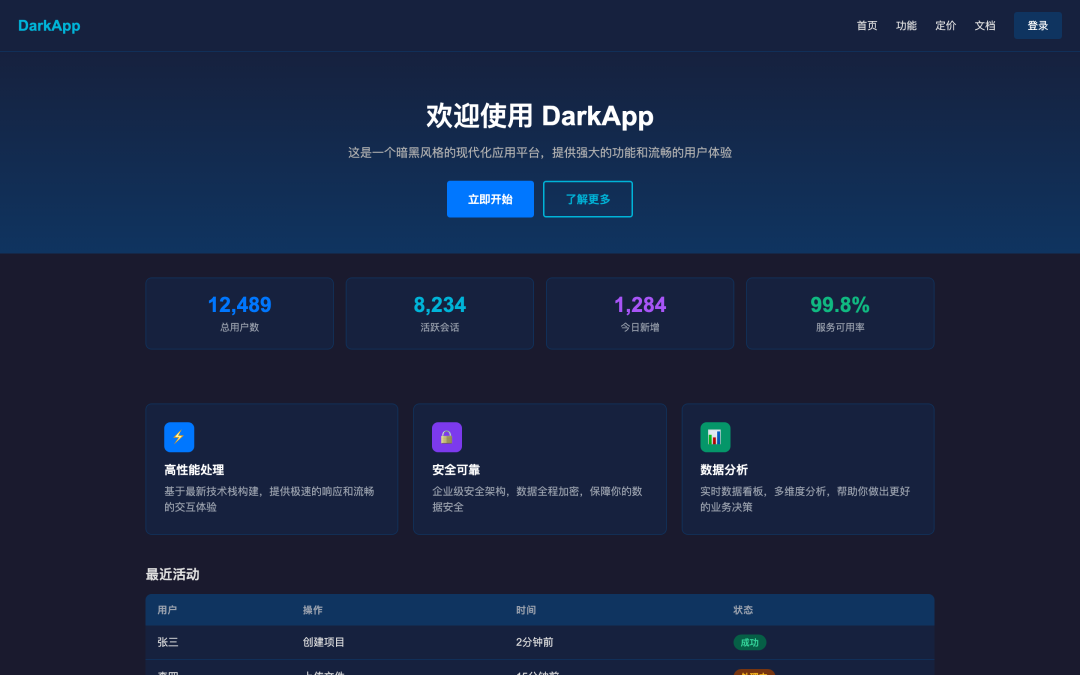
这套提示词给 AI 划定了视觉系统的边界。后续写功能需求时,在这套约束之上叠加就行。
第二套:管理后台(Admin Dashboard)
后台界面常见的问题
管理后台是国内最常见的业务场景。AI 做这类界面经常出两种问题:
第一种是太「设计库味」。直接复刻 Ant Design 或 MUI 的默认样式,颜色、间距、圆角都是框架默认值,看起来像一个没有定制的 demo。
第二种是功能色滥用。表格里的状态 badge 用了红、橙、黄、绿、蓝五种颜色,每种颜色都很亮,视觉上很嘈杂。实际上后台界面的功能色应该低饱和度,只在需要用户注意的地方才亮起来。
好的后台界面有几个核心特征:信息密度高但有节奏感,颜色系统克制,组件形态统一,导航层级清晰。
后台视觉系统的核心在颜色的结构性使用:主题色负责品牌感(按钮、链接、激活),功能色负责状态(成功/警告/错误/信息),其余界面以中性灰为主,颜色不作为装饰用途。
管理后台提示词
Design a professional admin dashboard with enterprise-grade clarity.

Layout structure:
- Fixed left sidebar: width 240px, background #1e293b (dark slate)
- Top navigation bar: height 60px, background white, border-bottom #e5e7eb
- Main content area: background #f8fafc (light gray), padding 24px

Color system:
- Primary: #3b82f6 (blue) — buttons, links, active states only
- Semantic colors (use low-saturation backgrounds for badges):
  success: text #059669, bg #d1fae5
  warning: text #d97706, bg #fef3c7
  error: text #dc2626, bg #fee2e2
  info: text #2563eb, bg #dbeafe
- Neutral scale: #111827 / #374151 / #6b7280 / #9ca3af / #e5e7eb / #f9fafb
- Never use semantic colors as full background fills — only as subtle badge backgrounds

Component rules:
- Cards: background white, border 1px solid #e5e7eb, border-radius 8px, shadow shadow-sm
- Tables: row height 52px, header 40px, alternating row bg transparent/#f9fafb
- Buttons: primary filled, secondary outlined, no gradient buttons
- Form inputs: border #d1d5db, focus ring #3b82f6 with 2px offset

Typography:
- Page title: 20px/700
- Section label: 11px/600, uppercase, letter-spacing 0.08em, color #6b7280
- Table cell: 14px/400
- Caption/helper: 12px/400, color #9ca3af

Spacing rhythm:
- Card internal padding: 24px
- Section gap: 24px
- Table row padding: 12px 16px
表格是后台界面里最容易乱的组件。加一条专门的约束会很有用:
Table behavior:
- Column headers: sticky, background #f9fafb, border-bottom 2px solid #e5e7eb
- Row hover: background #f1f5f9
- Action column: always fixed-width, right-aligned, contains icon buttons only
- Status column: always badge component, never plain text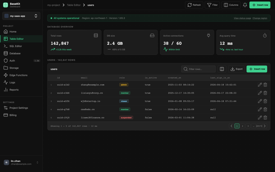
第三套:期刊排版(Editorial)
期刊风格难在哪里
这几套里最难出效果的是期刊风格。难的原因不是技术复杂,而是 AI 的训练数据里功能性界面多、以排版为主的设计样本少,做出来总差一口气。
期刊风格的核心是字体驱动,不是视觉元素驱动。主角是字体的大小、粗细、对比、间距,不是图片、卡片、颜色块。
有几个特征,缺一条就不像:
- 衬线字体(serif)用于标题。无衬线字体做不出这个感觉,不管多大号都不行。
- 大号标题,非常大。杂志大标题通常 64px 起,甚至更大。看起来夸张,但这正是期刊的气质。
- 留白要多,不要填满。段落之间要喘气空间,不是每个格子都塞内容。
- 正文列宽要窄。阅读体验好的正文,最大宽度 700-720px,超过这个宽度一行文字太长,眼睛跟行困难。
AI 经常做错的是:标题用无衬线字体,留白不够,内容铺满全屏,强行加很多颜色块来装饰,把一个排版问题变成了一个视觉堆砌问题。
期刊排版提示词
Design with editorial / magazine typography aesthetic.
Typography is the primary visual element — not images, cards, or color blocks.

Font system:
- Display / Hero heading: Georgia, Playfair Display, or EB Garamond (serif) — 64-80px, font-weight 700
- Section heading (h2): same serif, 40px/700
- Subheading (h3): Inter or system sans-serif, 22px/600
- Body text: Inter, 17px/400, line-height 1.75
- Caption / label: Inter, 12px/400, letter-spacing 0.04em, color #6b7280
- Pull quote: serif italic, 28-32px, border-left 3px solid #111, padding-left 24px

Color palette:
- Primary text: #111111
- Secondary text: #4b4b4b
- Muted text: #777777
- Background: #ffffff or #fafafa (pure, no warmth)
- Accent: ONE color maximum — or none. Bold typography IS the hierarchy.
  If using accent: recommend muted red #c1121f or inky blue #1d3557
- Do NOT use: gradient backgrounds, rounded cards, colored section backgrounds, badges

Layout:
- Content column: max-width 720px, centered
- Full-bleed sections: 100% width with ≥80px top/bottom padding
- Grid: text-image alternating layout, always left-right not stacked
- Horizontal rules: 1px solid #e5e7eb, use instead of cards/containers

Spacing:
- Section break: padding-top 80-100px
- Paragraph gap: 28px
- Never: overflow text into full-browser-width, compact spacing that removes breathing room
如果是给工具类产品做落地页(不是纯内容展示),可以在这套基础上加一点结构感:
Modifier for product landing page:
- Hero section: full-width, headline + subline + single CTA, no background image
- Feature list: 3-column text grid, icon optional but minimal (line icon only)
- Keep all other editorial rules intact — resist adding color blocks or gradients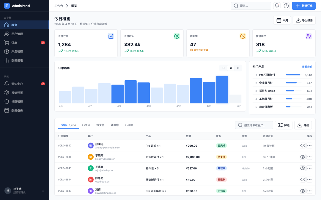
第四套:深色玻璃拟态(Dark Glassmorphism)
玻璃拟态的困境
玻璃拟态是 AI 最喜欢用、也最容易用坏的风格。
问题不在于效果本身,而在于 backdrop-filter: blur() 在没有合适底色和层次关系时,出来的是「脏」而不是「通透」。AI 经常随手在白色或浅色背景上加毛玻璃,效果一塌糊涂。
玻璃拟态真正成立的条件只有一个:背景本身够丰富。深色渐变背景、颜色层次有变化,玻璃效果才能把背景透出来,产生层次感。背景是纯色,加了毛玻璃也看不出效果。
另一个常见翻车:卡片用了半透明背景但边框太弱、或者没有边框,卡片直接「消失」在背景里,内容没有容器感,看起来像漂在空中的文字。
好的深色玻璃界面,背景靠渐变做深度,卡片靠微弱边框 + 比背景稍亮一点的半透明填充来界定空间。强调色要克制,只用一个,通常紫色或蓝色系最自然。
深色玻璃拟态提示词
Design a dark glassmorphism UI with layered depth.

Background:
- Rich dark gradient mesh as the foundation — use radial gradients:
  radial-gradient(ellipse at 20% 10%, rgba(99,56,200,0.45) 0%, transparent 60%)
  radial-gradient(ellipse at 80% 80%, rgba(14,80,196,0.4) 0%, transparent 60%)
  base: #0a0f1e
- Do NOT apply glassmorphism over flat or white backgrounds

Glass card system:
- Card background: rgba(255, 255, 255, 0.06)
- Card border: 1px solid rgba(255, 255, 255, 0.12)
- Card border-radius: 14-18px
- Use backdrop-filter: blur(16px) ONLY on cards that sit above layered backgrounds
- Do NOT apply backdrop-filter on every element — only primary containers

Text:
- Primary: rgba(255, 255, 255, 0.92)
- Secondary: rgba(255, 255, 255, 0.5)
- Muted/caption: rgba(255, 255, 255, 0.3)
- No warm or yellow tones — keep text pure white/cool

Accent:
- Single accent only: #8b5cf6 (violet) or #818cf8 (indigo)
- Use for: interactive states, highlights, key data points
- No multi-color decorations
- Semantic states: success #34d399, warning #fbbf24, error #f87171

Rules:
- No glassmorphism on white or light backgrounds
- No more than 2 layers of glass (card inside card is fine, 3 layers becomes illegible)
- Icons: Lucide, 16px inline, 20px standalone
- No emoji as icons anywhere
- No decorative gradients on text
第五套:极简 SaaS 落地页(Minimal SaaS Landing)
极简风格容易踩的坑
极简不是「什么都没有」,是每个元素都有必要存在的理由。AI 做极简风格有两种极端:一种是真的空着,导航没有层次、Hero 没有力度、页面没有节奏;另一种是放了很多东西但自称极简,背景加了浅灰色块、按钮有渐变、卡片有阴影——这是「伪极简」。
SaaS 落地页的极简风格有几个关键特征:
页面是白色的,真的白色。不是浅灰 #f8fafc,不是米白 #fafaf9,就是 #ffffff。区域分隔靠 1px 的浅色分割线,不靠背景颜色变化。
大号无衬线字体,高字重 hero 标题。极简 SaaS 通常用 Inter 或类似的现代无衬线字体,hero 标题 48-56px、font-weight 700、字间距 -0.03em 以上的紧排。
只有一个主操作按钮,颜色是唯一的「有色」区域。主色按钮饱和度不能太高——#2563eb 这类中等饱和度蓝比 #3b82f6 在白底上稳重很多。页面其他地方基本是黑白灰。
图标用线条图,不用填充。Lucide 默认就是线条图标,恰好符合。
极简 SaaS 落地页提示词
Design a minimal SaaS product landing page.

Background & layout:
- Page background: pure #ffffff — no light gray, no warm white, no sections with background fills
- Section separators: 1px solid #f1f5f9 horizontal rule only — no background color changes
- Max content width: 1120px centered
- Section padding: 80px vertical minimum

Typography:
- Font: Inter (700/600/500/400 weights)
- Hero heading: 48-56px, font-weight 700, letter-spacing -0.03em, color #0f172a
- Section heading: 28-32px, font-weight 700, letter-spacing -0.02em
- Body: 16-17px, font-weight 400, line-height 1.65, color #475569
- Label/overline: 11px, font-weight 600, uppercase, letter-spacing 0.1em, color #2563eb

Color:
- Primary: #2563eb (mid-saturation blue — not too vivid)
- Text dark: #0f172a
- Text mid: #475569
- Text light: #94a3b8
- Border: #f1f5f9 (barely-there)
- Never: gradients, tinted section backgrounds, multi-color CTAs

Buttons:
- Primary: background #2563eb, text white, border-radius 8px, no gradient, no shadow
- Ghost: text only with icon, no border, no background
- Only ONE primary CTA per page section — do not add secondary filled buttons

Icons:
- Lucide icons only, line style (strokeWidth 1.5)
- Size: 18px in feature cards, 16px inline with text
- Color: same as text context or primary blue for feature icons
- No emoji, no filled icons, no colorful icons

Components:
- Feature cards: white bg, 1px border #f1f5f9, border-radius 10px, padding 24px
  Icon container: 36x36px, background #eff6ff, border-radius 8px, icon color #2563eb
- Navigation: white bg, bottom border 1px #f1f5f9, height 60px
- Stats/proof bar: background #f8fafc, border-top 1px #f1f5f9

Rules:
- No glassmorphism
- No dark sections (footer can be exception)
- No box-shadows except: box-shadow 0 1px 3px rgba(0,0,0,0.06) on interactive elements
- No hero background image or gradient
怎么用这五套,以及可以混用的地方
五套风格对应的场景比较明确:
- 暗黑 UI 适合开发者工具、监控系统、游戏产品、终端类界面,以及希望表达「高科技感」的展示页
- 管理后台 适合 B 端业务系统、数据看板、内部工具,信息密度高的场景
- 期刊排版 适合内容型产品的落地页、个人主页、博客、品牌宣传页
- 深色玻璃拟态 适合数据大屏、高端产品展示、需要「视觉冲击力」的 showcase 页,以及面向 C 端的数据展示类界面
- 极简 SaaS 适合工具类产品落地页、独立开发者产品、技术产品的官网,以及追求「专业感」而不是「设计感」的场景
这五套适当混用也可以。常见的组合:
期刊 + 暗黑:期刊排版作为整体框架,暗黑处理特定模块(代码展示区、terminal 风格演示块)。两者都克制、没有多余色彩,混用不会产生视觉冲突。
管理后台 + 极简 SaaS:对外展示的落地页用极简 SaaS 风格,点击进入产品后的后台界面用管理后台风格。两套各司其职,整体视觉上连贯。
暗黑 + 玻璃拟态:暗黑作为基础,某些 hero 区域或数据展示模块用玻璃拟态增加视觉层次。背景渐变层次一定要做到位,毛玻璃才能透出东西来,否则效果就白费了。
苏米注:把这五套提示词放在功能描述的最前面,作为整体的视觉约束系统。功能描述在这套约束里自由写,不用再操心颜色和字体。核心思路就是:不是让 AI 自由发挥,而是给它一个有约束的系统。约束越清晰,输出质量越稳定,返工次数越少。
进一步调整的思路
这五套提示词是起点,不是终点。实际用下来,通常有两个方向的调整需求:
品牌色替换。把提示词里的主色换成团队自己的品牌色,其余颜色关系不变。重点调整:主色(按钮、链接)、以及 semantic info 色(通常和主色同色系)。暗黑和玻璃拟态套需要同步调整 rgba 透明度版本的颜色参数。
密度调整。如果默认间距太松,把 spacing rhythm 里的数字整体缩小 20-30%。如果太紧,反向放大。不要只改某一个数字,整体比例保持一致,界面才不会别扭。极简 SaaS 套如果要紧凑一些,重点压 section padding;管理后台套如果信息量很大,可以把 table row height 从 52px 降到 44px。
五套风格的底层逻辑都是一样的:不是让 AI 自由发挥,而是给它一个有约束的系统。约束越清晰,输出质量越稳定,返工次数越少。